Treating epocrates
My Role
My role in this project included being a project manager and a UX researcher. Over two weeks, we utilized extensive user research and UX design testing to better optimize competence in gaining access to desired medical information. I started with a focus on research so that I could bring together my findings to be included in the overall design of the final product. What I found was that through usability testing and an iteration process, I was able to create a consistent viewing and editing experience for users. The tools I used to complete this project were Figma, Asana, Microsoft Office, Google Drive, Adobe Photoshop, and Zoom.
Scope of Work
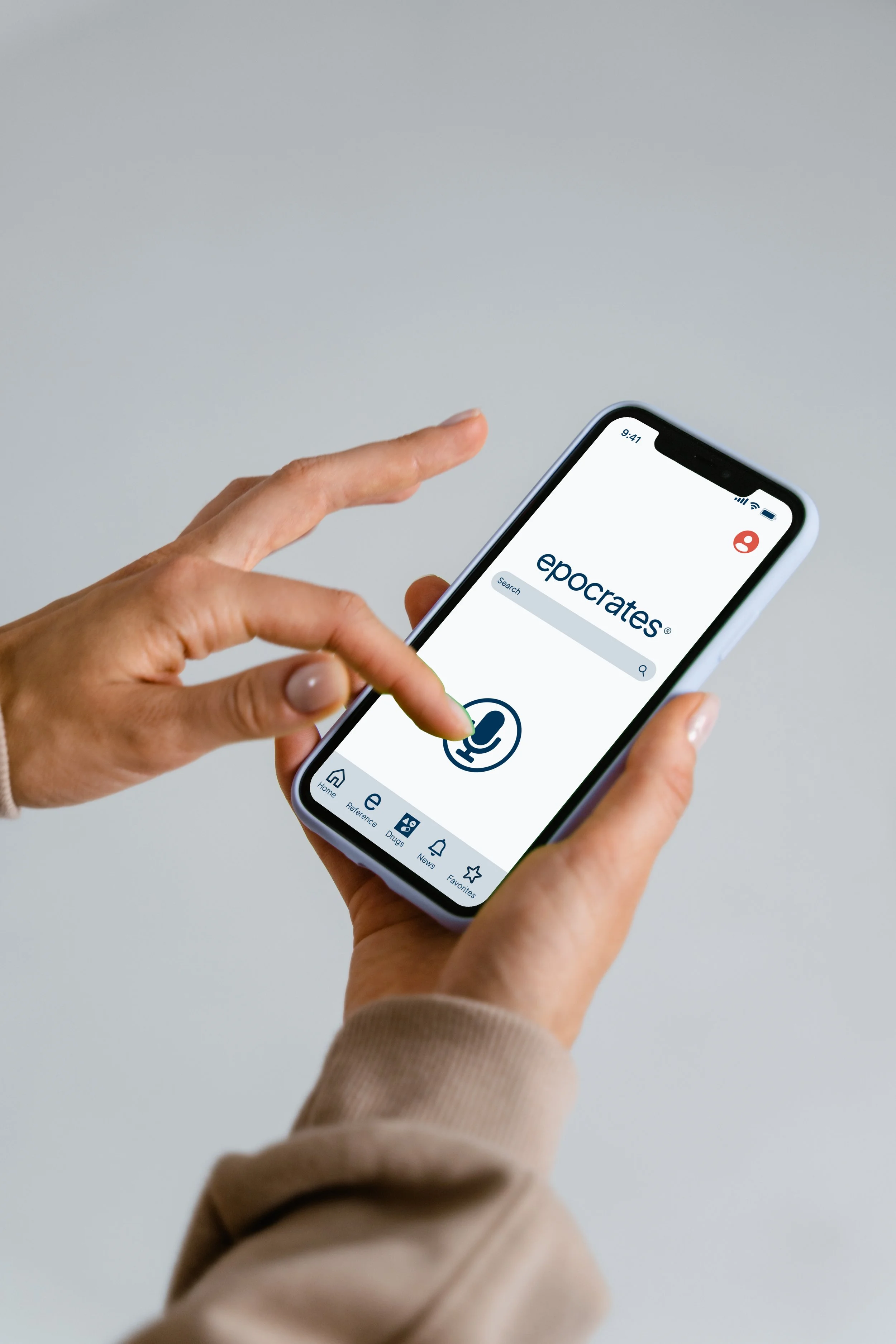
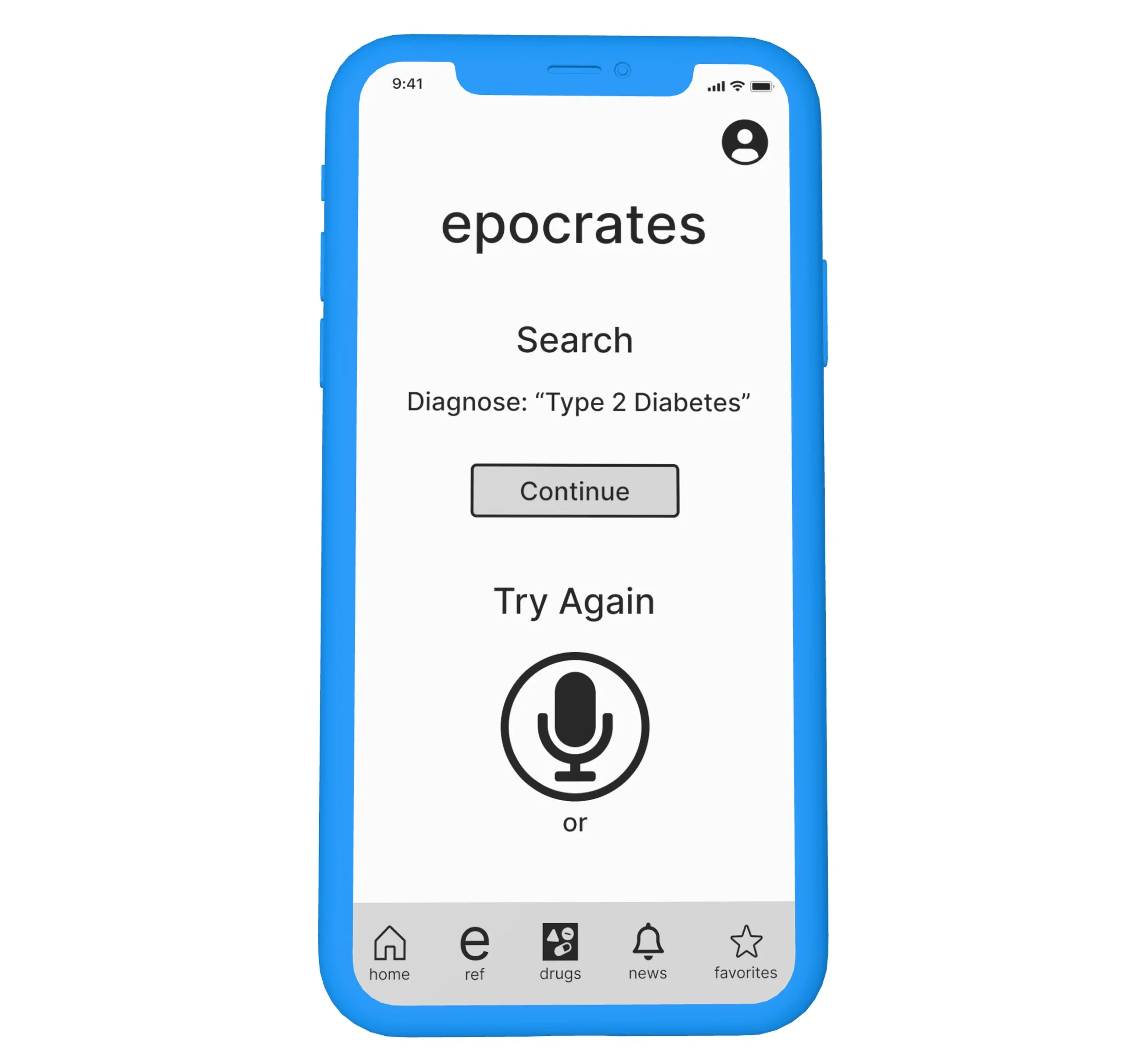
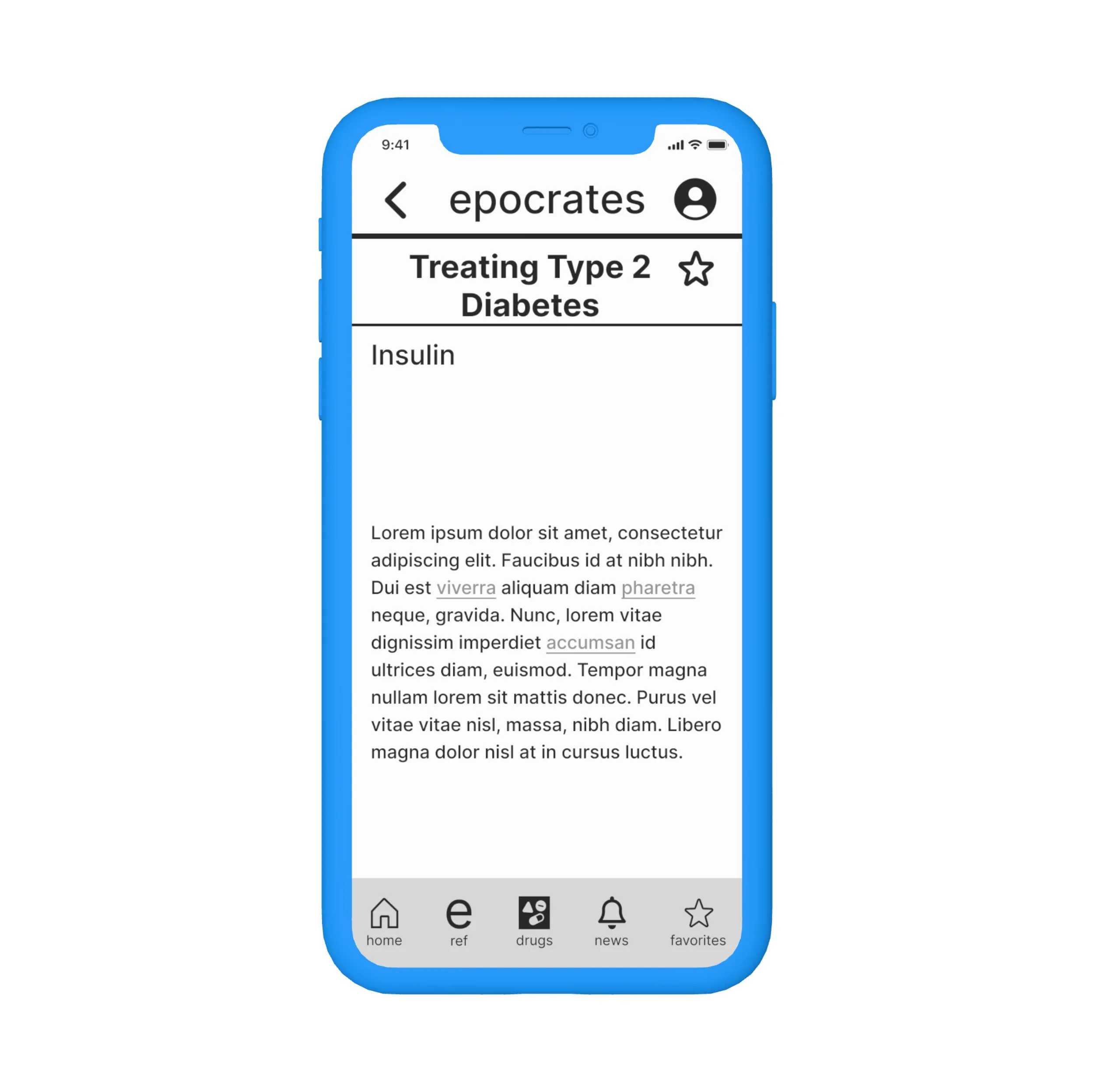
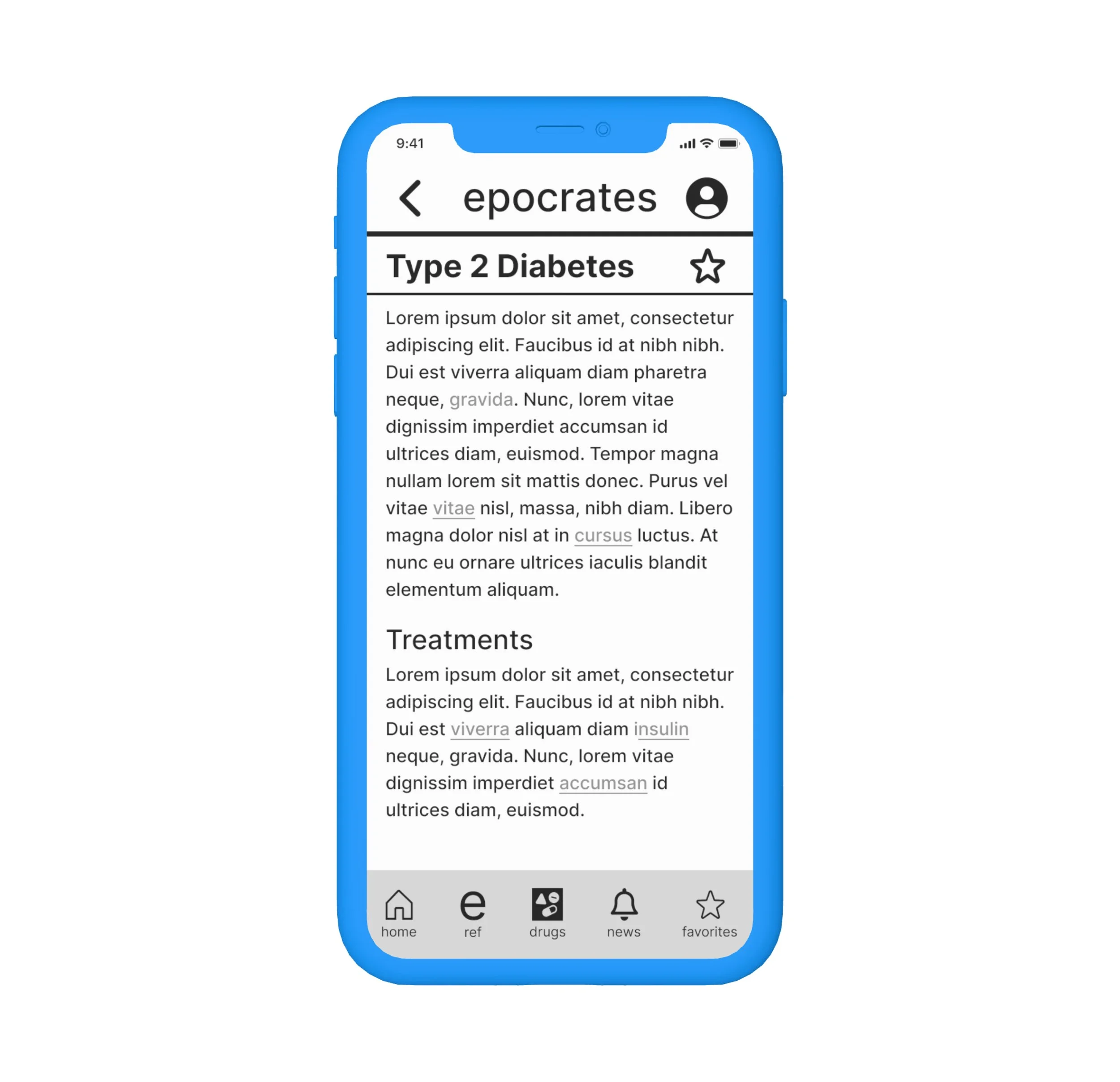
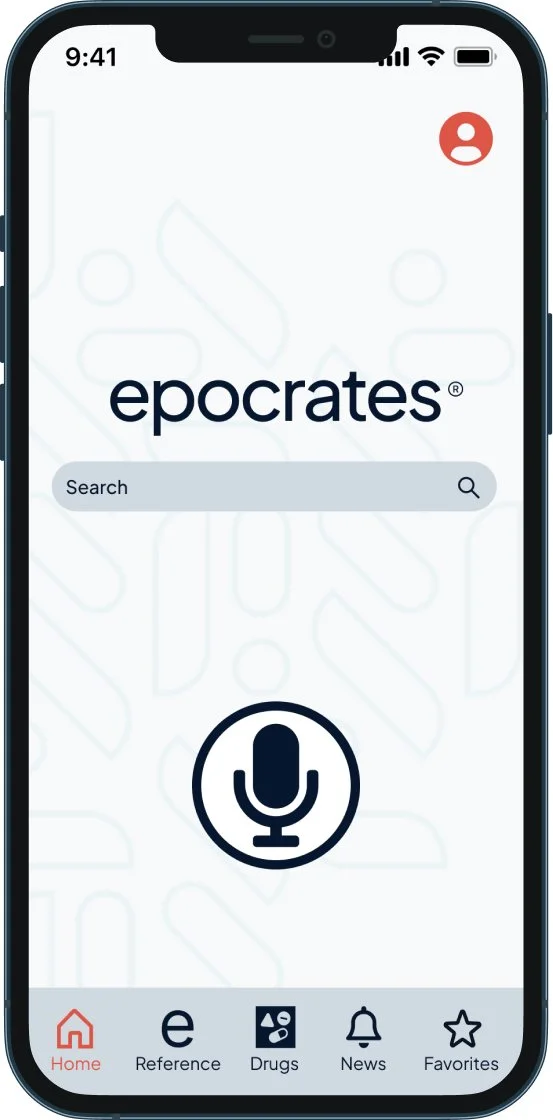
The original Epocrates application was both active and usable, but had an issue with cognitive overload on the home page. Our initial research found that users struggled to efficiently navigate from the home page to their desired findings. Further analysis revealed that a talk-to-text feature would be valuable in allowing users to gain direct access to the requested page without having to click through multiple screens to get there. This talk-to-text feature was added, as were hyperlinks that allowed users to readily connect to similar articles without leaving the current page.
Problem Statement/HMW’s
How might we support healthcare workers in quickly accessing up-to-date information to help them make informed clinical decisions?
How might we support healthcare workers in quickly searching for drug information and interaction checks?
How might we support healthcare workers in quickly researching and referencing articles within the app?
Research
To better identify the problem, our team conducted 8 user interviews and surveyed 23 healthcare professionals to better understand 1) what is important to a healthcare professional when using an app like Epocrates and 2) to identify problems when using medical reference apps. Findings revealed that healthcare professionals prefer apps that are well researched and include articles with references within. To better accommodate their busy days, they also favor apps that allow them quick ways to search for medical information.
Utilizing these research methods, we looked at the similarities and differences of medical application competitors. The finding that stood out was that only one medical reference application offered the talk-to-text feature.
A further look at the C&C analysis allowed us to better understand how many clicks and screens the user had to transition through to reach the goal of the assigned task. This put more emphasis on creating less clicks so that the user could save time throughout their search.
Research from our user persona, journey map, and survey testing allowed us the ability to determine what would make the application more user friendly. It was decided that in adding a talk-to-text feature, Epocrates would become more accessible for users. Additionally, added hyperlinks would allow users to efficiently find more information about their topic A proposed user flow was then created to help Epocrates reach this goal.
Putting it all together
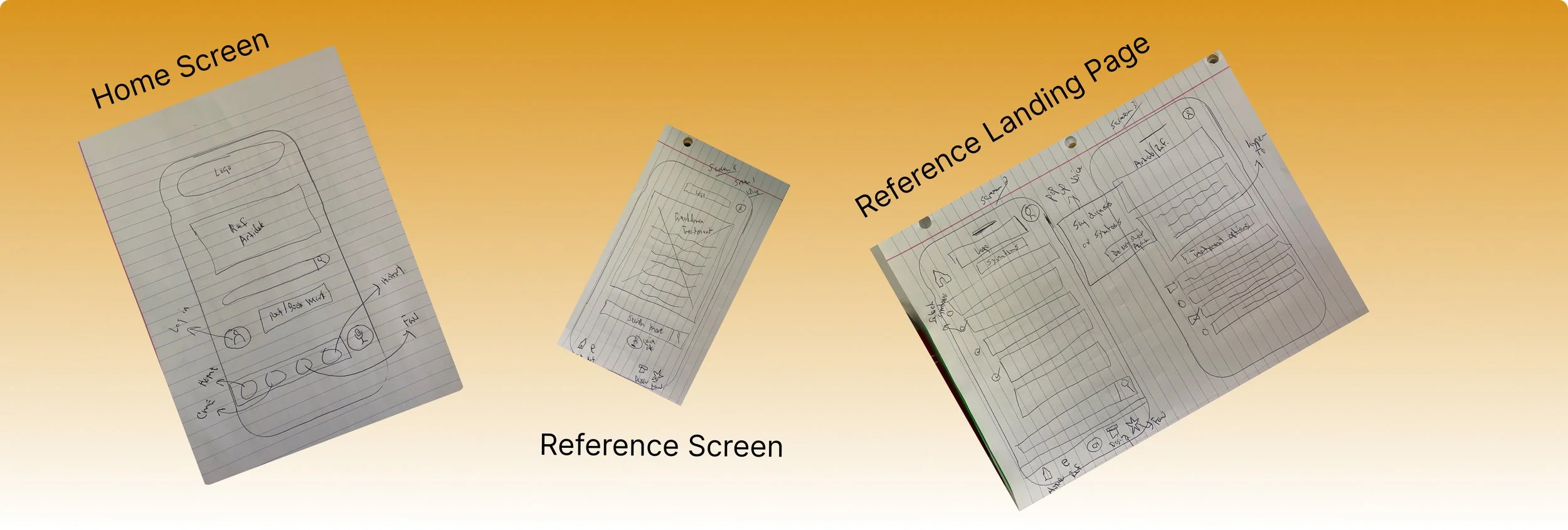
Paying close attention to the discovery and research, we reached a point were we could start to focus on putting our findings together in sketch and then move into our first round of prototyping. Sitting down and Sketching out how we could incorporate a design for Talk-to-text into epocrates already functioning platform, but also staying within there current design systems.
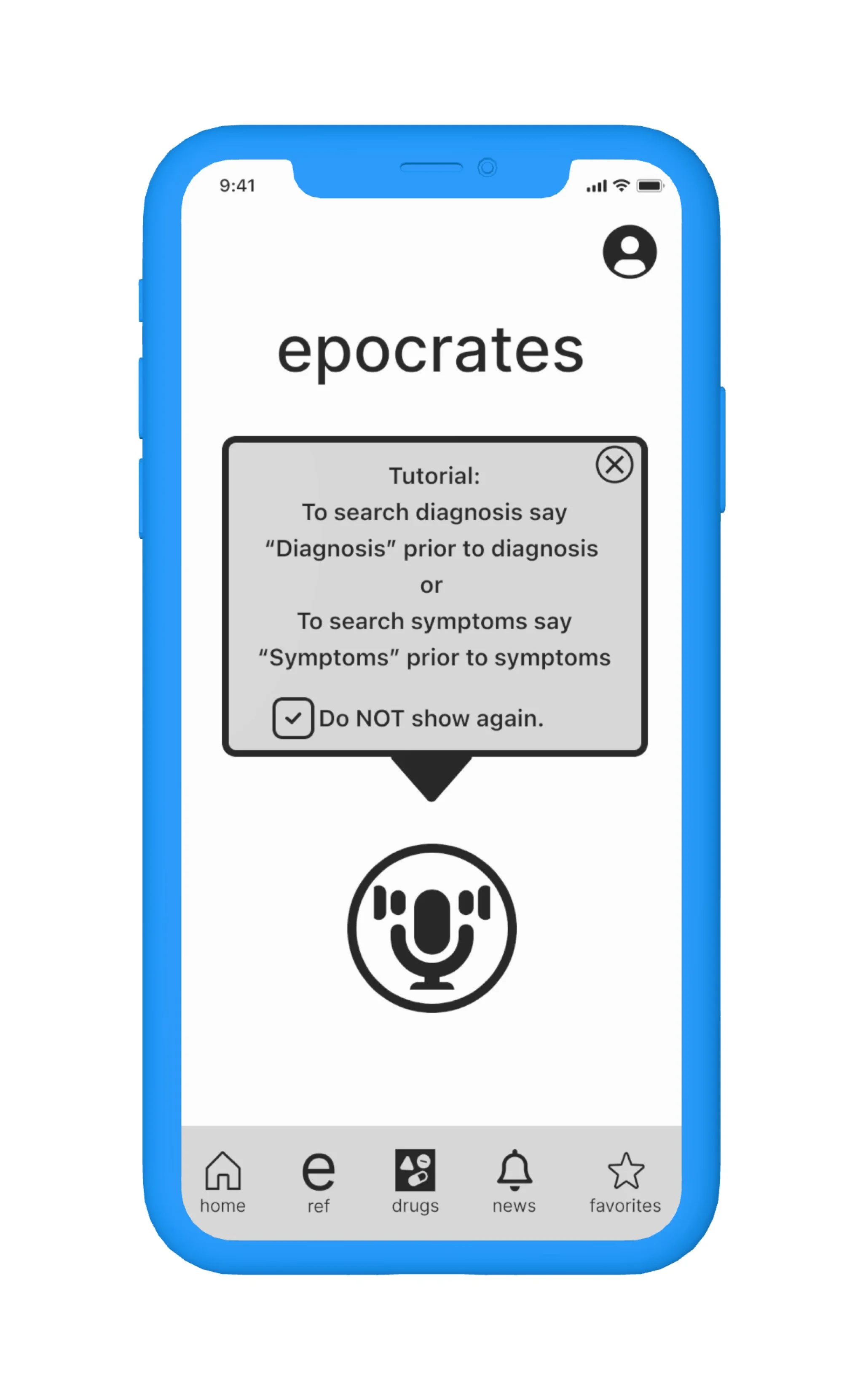
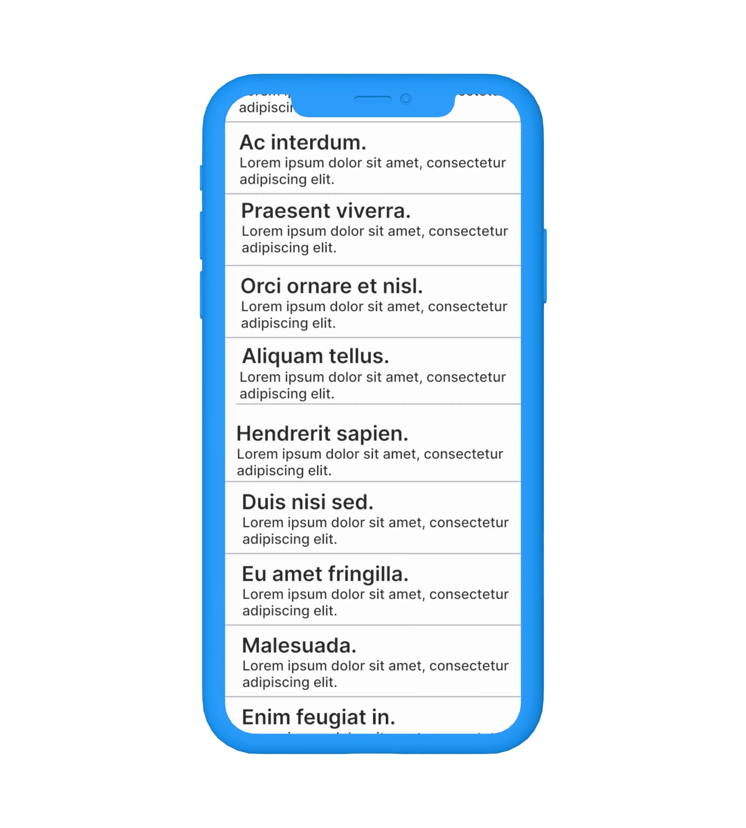
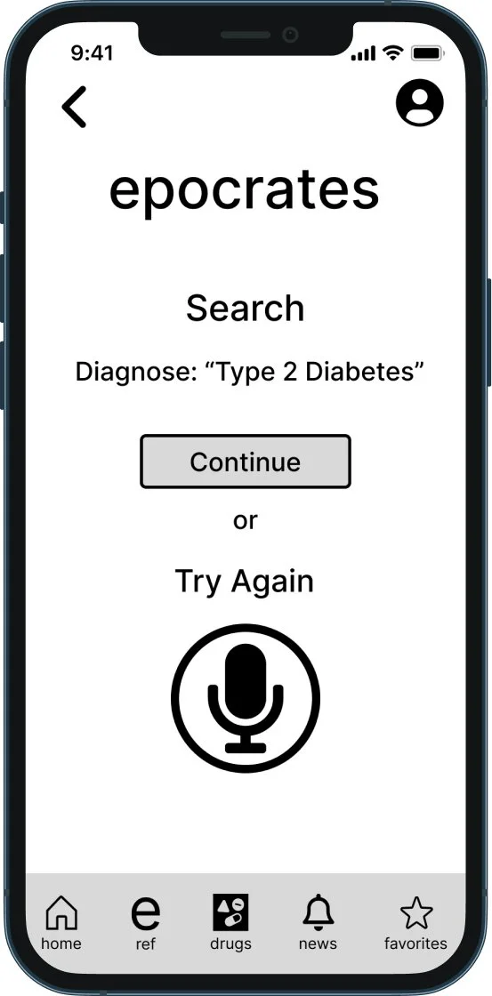
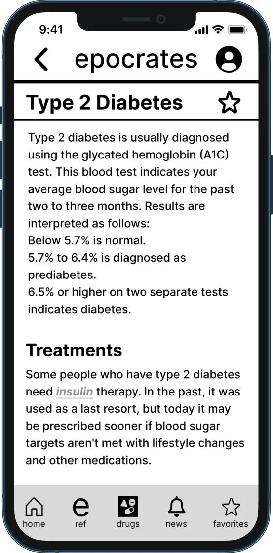
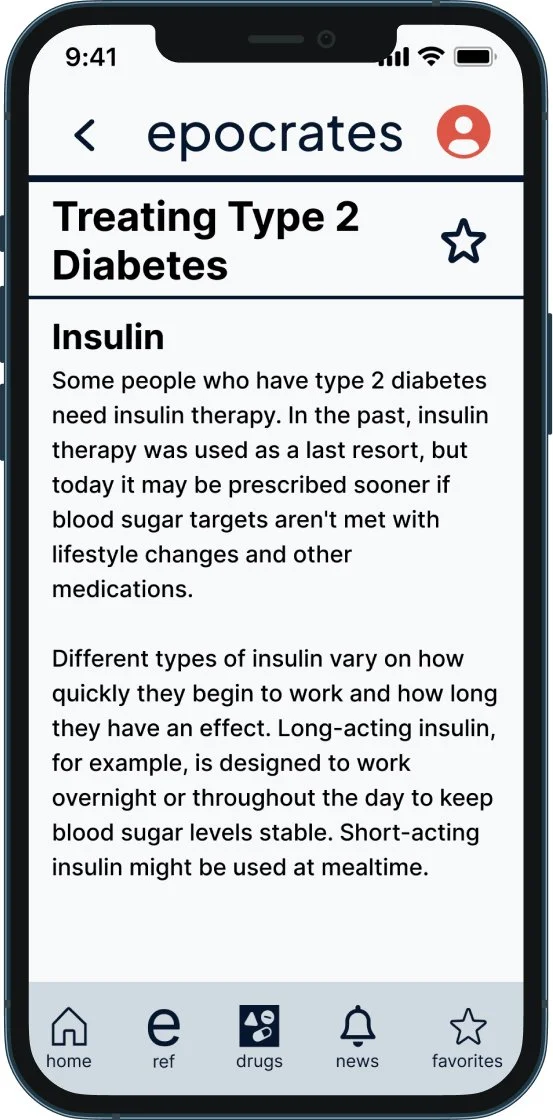
After creating and sketching ideas of what the design would look like, we constructed our first prototype and wire frames. The first iteration included an image of a microphone to indicate the talk-to-text feature, along with an instructional pop up on how to use it. The CTAs were also moved to the bottom portion of the screen to make the one hand tradition easier. Not only did we aim to cut down on the amount of information that was visible on the home screen, we changed the location of the search bar and put it in the middle of the home screen, making it more visually appealing. Hyperlinked words were also added and underlined throughout the article to emphasize that the user can click it if they want more information about the topic.
Usability testing
After administering the first round of usability tests, we were able to put together all of the evidence and synthesize the results. Quantitative data showed 7 out of 8 participants expressed confusion regarding the talk to text feature. 4 out of 8 participants hesitated when identifying the reference article.
Average SUS score = 90
Average number of errors using the talk-to-text feature = 3.25 errors
Data pulled from the SUS score and the overall review of the usability tests led us to the second prototype design. It was decided that the next prototype needed to include letting the user know that the application was listening.
Final Design
Results of the second usability test helped narrow down the flaws of the first round of iterations. In giving users the same tasks to complete in the second round as the first round, we found that more confirmation was needed to determine that the talk-to-text feature was working. We added animation so that the app would list the words as the user spoke. This confirmed to the user that what they were saying was being picked up. Color was also added to the hyperlinks so users could confirm that the word they were clicking on was clickable.
When searching the talk to text feature, the average number of errors = 2 errors, with the average # of clicks to complete tasks was 3.4
Referencing task error rate was 1 and the average click through task rate was 1.4
Average SUS score = 95.4 (5.4% increase to first round of testing)
Time to complete assigned tasks using talk-to-text feature was 38 seconds
Time to locate reference to treatment average time was 20 seconds
100% of users wanted confirmation that indicated voice command was successfully received by app
Takeaways
Working through research results, I found that most of our users still had issues with the talk to text feature even with the additional iterations that were made.
During the 2-weeks project sprint, we came up with a possible A/B testing scenario. We created different iterations of the second screen try again button so that we could determine the best location for the button.
Comparing the original layout of the Epocrates application vs what we were able to design, I was highly impressed with the way our research material was synthesized and utilized. I would love to have the opportunity to conduct further research and usability testing to identify improvements that could be made to the Epocrates platform.
