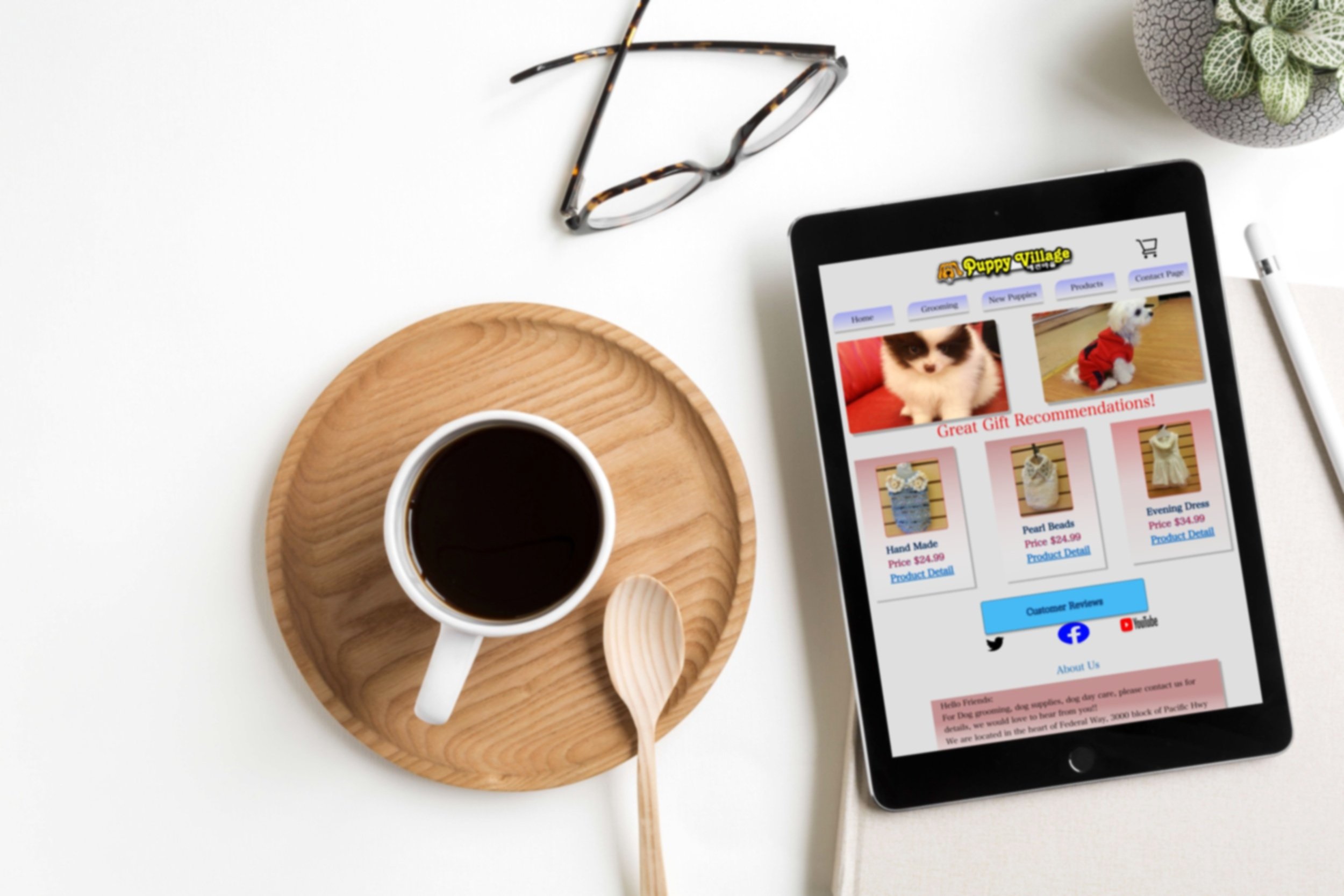
Project Puppy Village
The problem
The users were confused about how to navigate through the site and were having difficulty during the checkout process. They were spending too much time searching through product reviews instead of looking at facts related to the product they were interested in. During the process, not only did this cause the user to become frustrated, but it also decreased transaction numbers due to users not understanding how to operate the website.
My role & process
I was the sole UX designer on this 2 week project sprint. During this project, I followed a structured research process which included: a task analysis, persona, journey mapping, user flows, sketches, C&C analysis, wireframe, site map along with usability testing, mock ups, and prototyping. I also put together the final visual Hi-Fi prototype and presentation.
Open the Kennel/Research
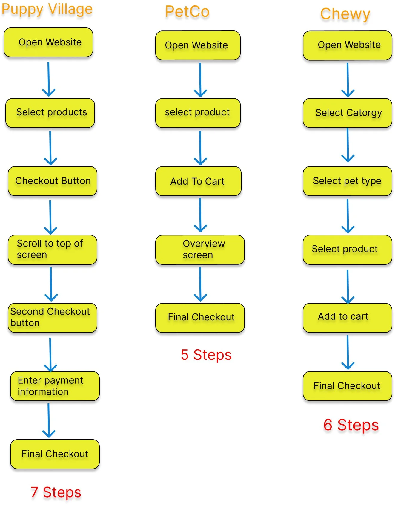
During the initial research process, I found that Puppy Village had issues with users getting through the checkout process without becoming confused. Once the users got to the checkout portion of the website, there was no clear path that allowed users to click through to the final payment screen. To complicate matters more, the user had to try and guess what product descriptions were in reference to, as there were no pictures to go along with the reviews. After an initial interview and some research, I was able to put my findings together and come up with a C&C analysis. I was curious to see just how long it took users to get through the checkout process compared to other companies with similar products. As I reviewed my results, I found that the Puppy Village checkout process took the user a total of 7 steps, whereas users for similar companies completed the same process in 5-6 steps. Additionally, these competing companies also offered 3 times the product that Puppy Village did.
Making Sense of the Research
As I gathered the data from my research, I put together a user persona and journey map to better identify the various touch points in the checkout process. I also added touch points that had a direct impact on the problem statement.
Options and organization leading into the purchase: Have the price and picture options on one screen as opposed to multiple screens.
Suggestion information: Place product toward the top of the home screen so there is no scrolling when user wants to quick buy.
Enlarge CTAs: Make the online purchase process easier to understand and increase the usability of checkout steps. This will make the search process less confusing.
Factoring in the pain points and referencing back to my persona and journey map, I wanted to make sure I was cutting down on the amount of steps needed to complete the checkout process. I utilized a site map and made sure the click through process was less than the 7 clicks it originally took to get through checkout. I did this by cutting down the number of screens it took to get to checkout, and I also aligned the CTAs for higher accessibility.
Put the Jacket on the Puppy Design/Wireframe
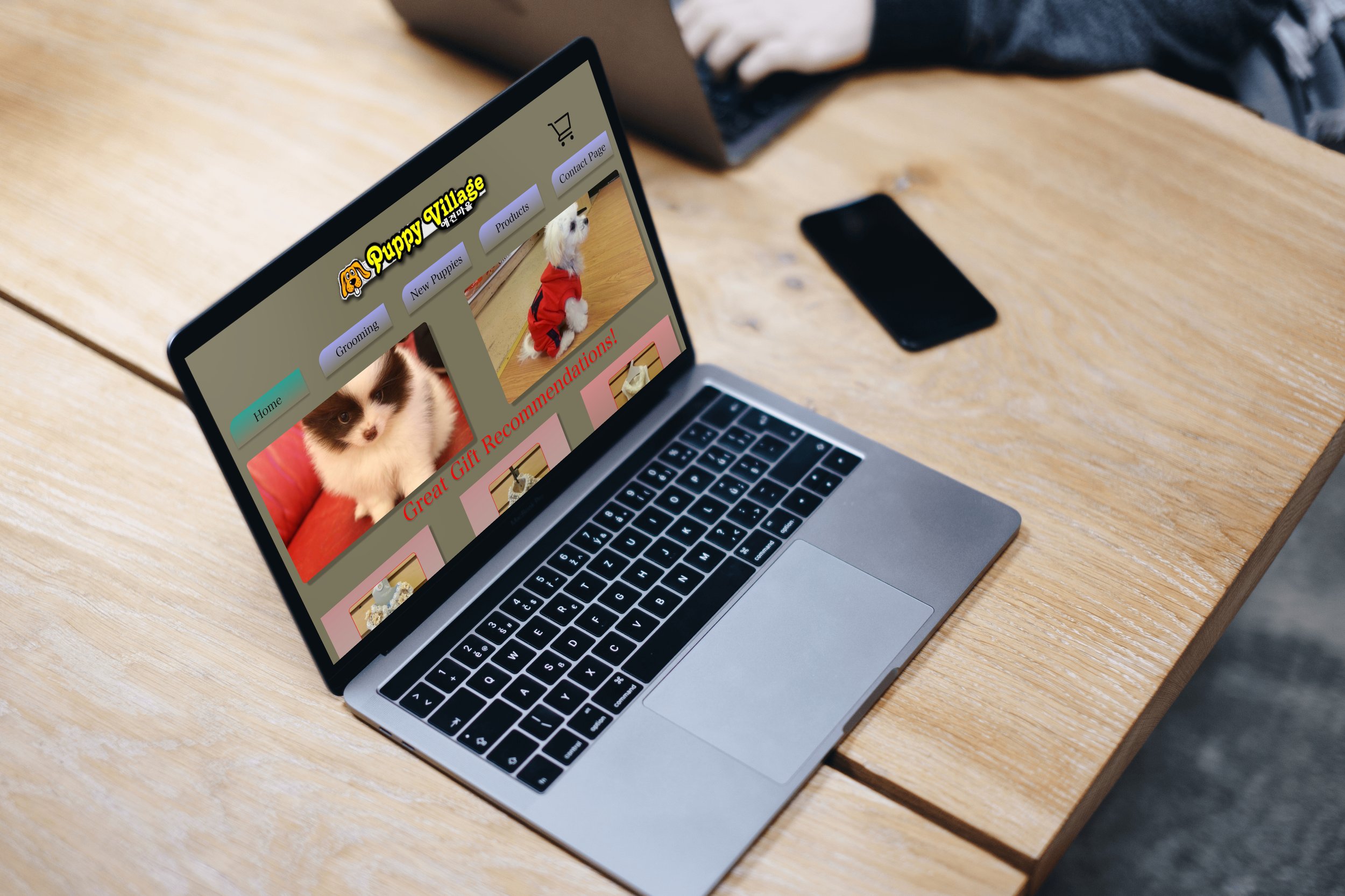
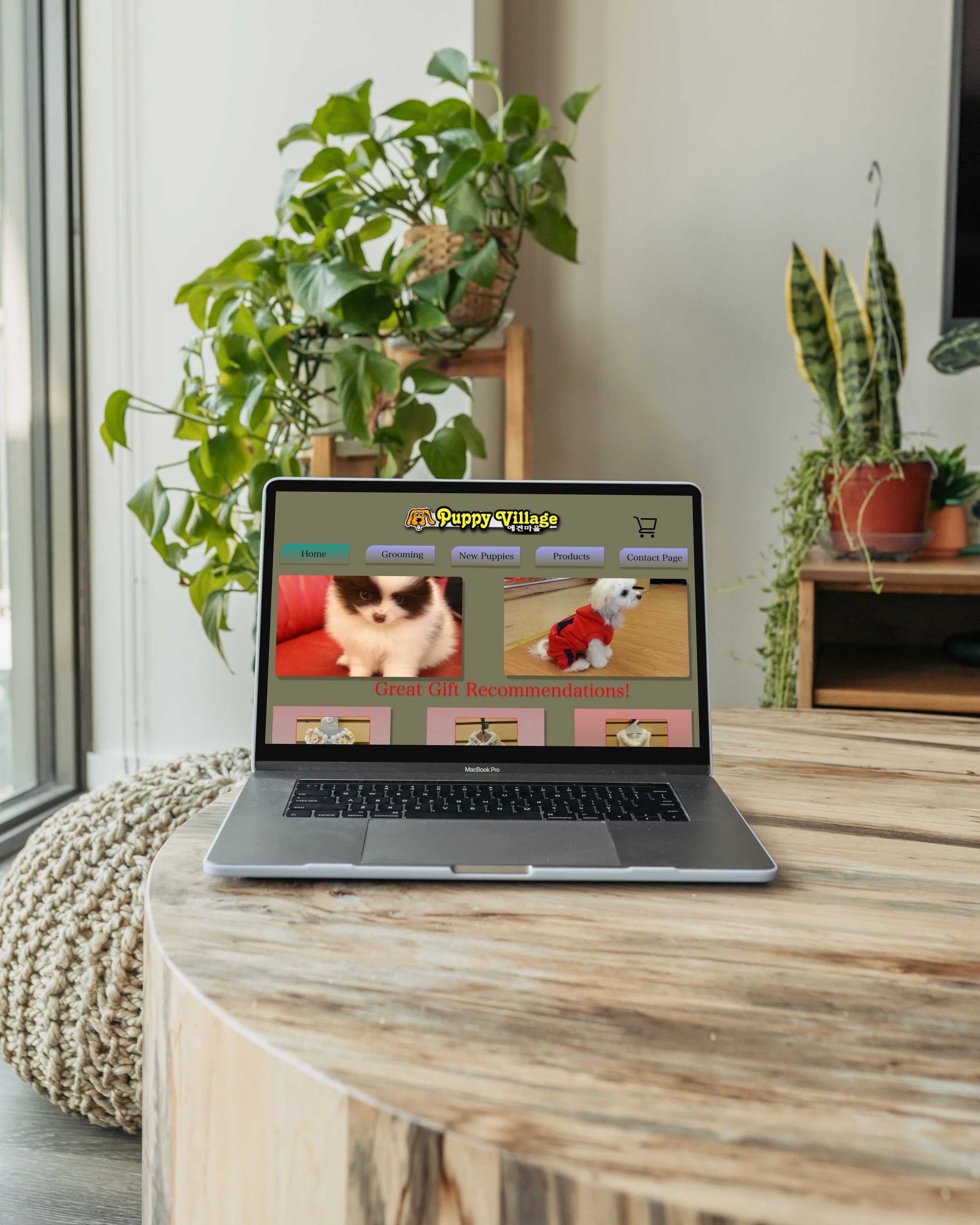
Using my research methods, I was able to sit down and brainstorm. I sketched out what the potential process might consist of and visualized how it would look. Once I came to a conclusion, I put together my first product wireframe. My main goal was to keep the initial problem in mind and make the checkout process more user friendly. Because the website pertains to puppies and puppies are playful, I tried to keep the design lively. To do this, I used clear CTAs that were colored to match the action throughout the website.
Evaluation & Findings
For evaluation, I put together a group of 4 users through word of mouth and my educational connections. Participants were asked to use the prototype and think out loud during the navigation of benchmarked tasks.
The first round of usability testing shed light on a few issues. Several of the users had difficulty in locating the CTA buttons when trying to enter in information on the final checkout screen. This issue was reflective of the overall time it took to complete the task. There was also an issue that users had trying to go back to a previous screen, or exit the purchase process and return back to the cart to add additional items. Before they could do this, they had to fully complete the purchase. Once the purchase was complete, they could then exit out or return to reviewing more products.
Iterations were made and I moved the CTAs into positions that would allow the user to quickly identify their location during the entire information entry. I also added a home button at the top of every screen to allow the user to move back to the previous screen if they desired.
At the conclusion of the interview, I found the overall impression was good. Users thought the checkout process was clear and each step was easily identified. Users also liked the option to schedule a grooming appointment at same time as purchase. On top of moving the checkout button to a more ergonomically effective position, I changed the color, which added even more ease to the checkout process.
What I learned
Usability tests are key: Working my way through the usability tests, I found there was a lot of information that was produced when it came to the overall outcome of my prototypes. I would love to continue the process and find out how the full working site would react with a few more updates.
Make copies of all research findings: When going back over my research materials, it would have helped to have them all in one place. This would have made it easier to cycle back and reference the entire pool of research when I needed it.
Keep it simple: Midway through this project sprint I had to remind myself that there is no such thing as perfect. Even though I wanted everything to be flawless, I reminded myself and my usability test users that it is a prototype and there are still things to work on and iterations that need to be made.
Don’t be afraid to change gears: When doing research in the development process, don’t be afraid to add new methods and scratch a method if it is going to help in solving the problem situation. Don’t be hooked to one system of research. Branch out and be open to new information and idea’s.
