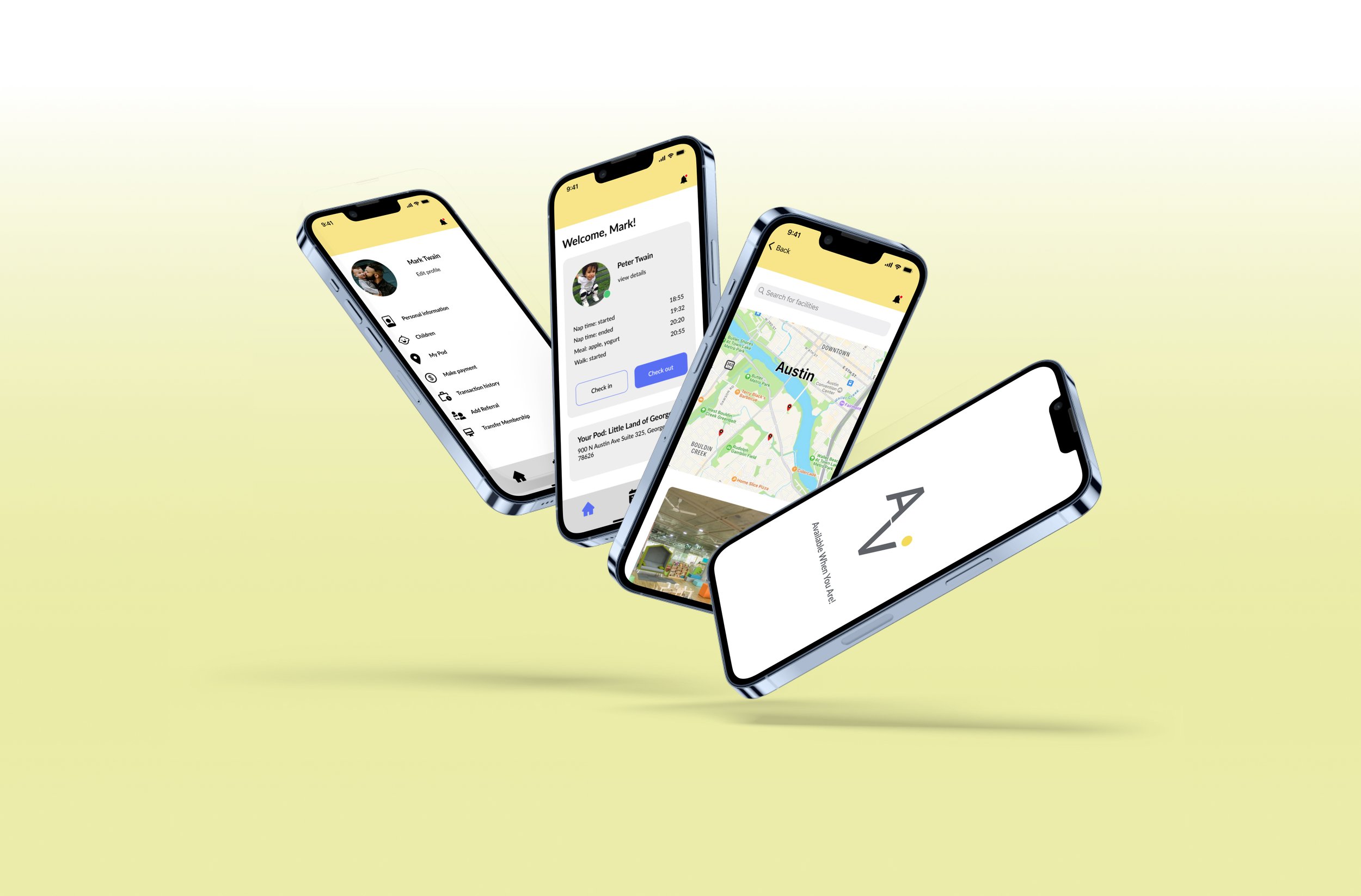
Avi Care
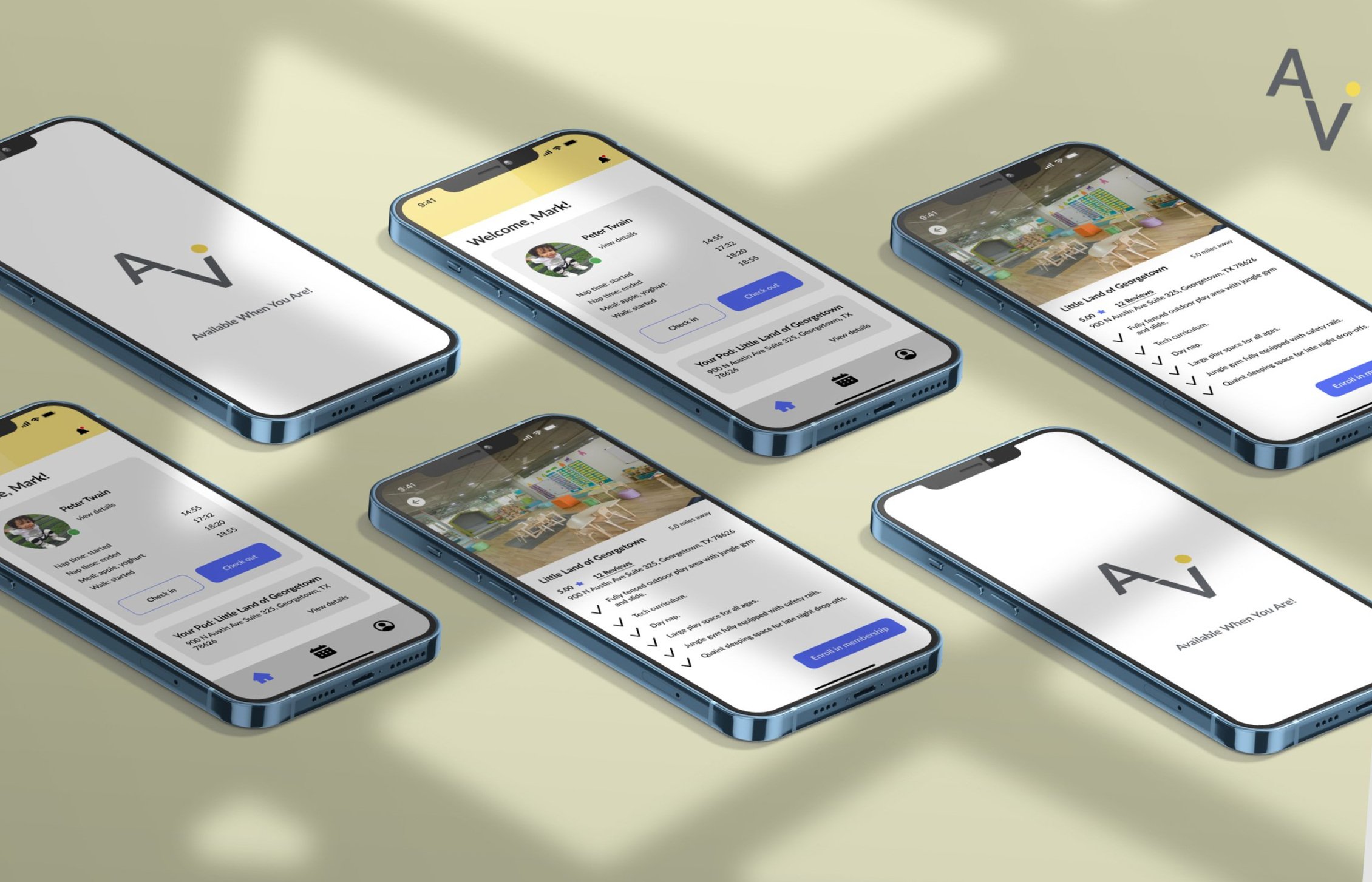
Childcare re-imagined! Avi is a premier platform that works to provide unlimited and flexible childcare to exclusive members.
Challenge Statement
Users wanted to receive reliable, best in class childcare services after traditional business hours, which included nights and weekends because they don’t want to miss work, business, and personal opportunities.
How might we give the user confidence that they are getting flexible and exclusive childcare benefits?
How might we provide parents with information regarding the availability of the parent selected pod?
How might we give the customer different levels of pay options?
How might we give the user update options for their child during care hours?
Bench Marking
Before jumping straight into the design, I was curious to see how similar exclusive membership organizations worked. Due to Avi Care being relatively new, I carried out a comparative and competitive analysis in a plus and deltas format in hopes of uncovering a key structure that would allow for a clear and clean blueprint of our product.
Discovery/Research
Using the results from the plus & delta analysis, we put together and scheduled interviews to capture the opinion of parents that fall within the Avi Care demographic. After synthesizing the interview data, we found 3 key components that were important to 82% of our user interview pool.
Market Analysis
Extending our research into the market of child care as a whole, we found there was a very high demand for after hour child care. This allowed us to bring information to light and step into the shoes of our users.
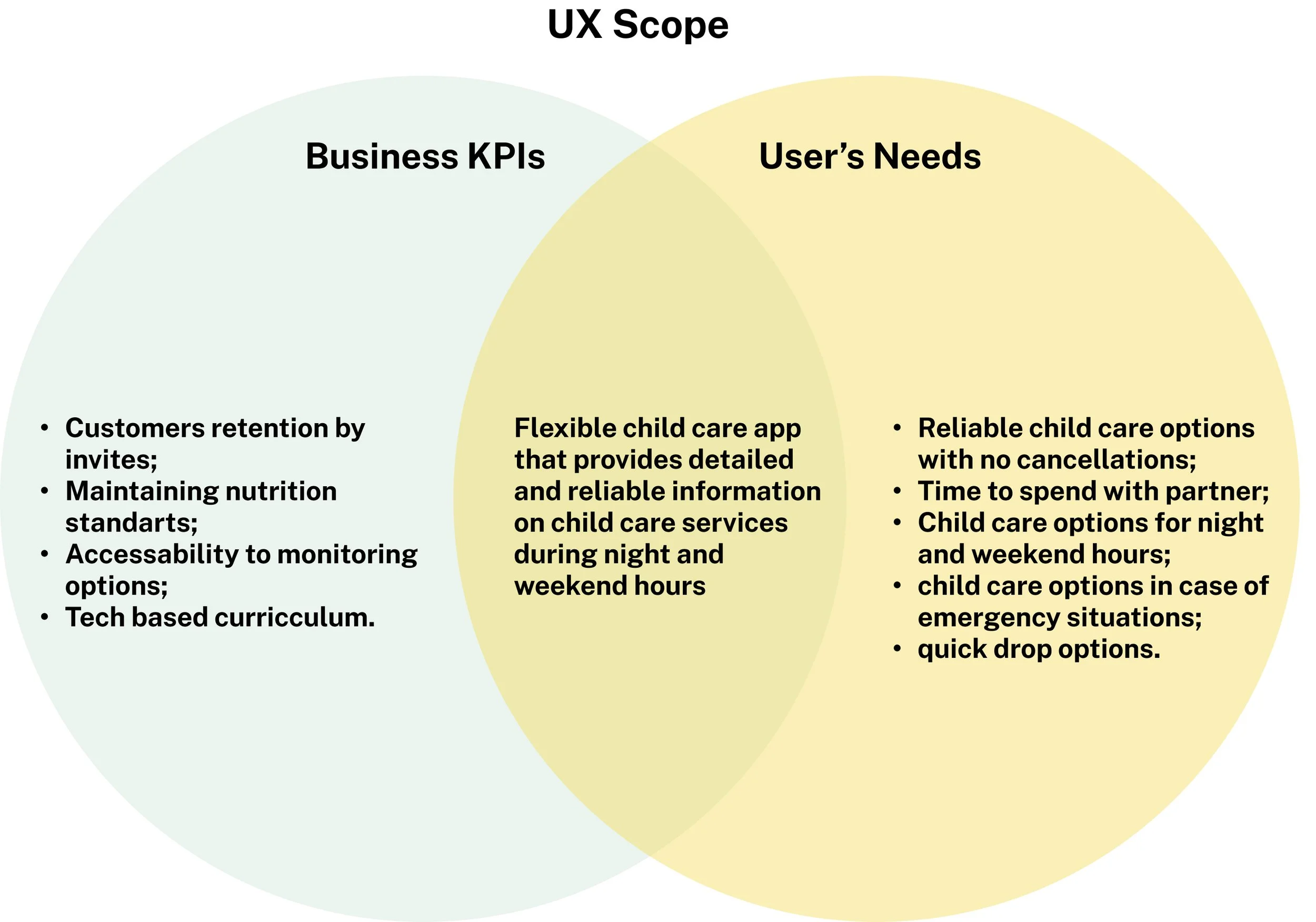
User needs were identified and combined with business goals to create a concentrated user experience that would meet the overall goal design of the Avi Care parent centered mobile platform.
User needs:
Bring flexible child care app to parents.
Create transparency between Avi Care and parents.
Give parents the ability to check on their child at their leisure.
Give parents options for childcare if something unexpected arises.
Create a learning curriculum.
Define/User Flow
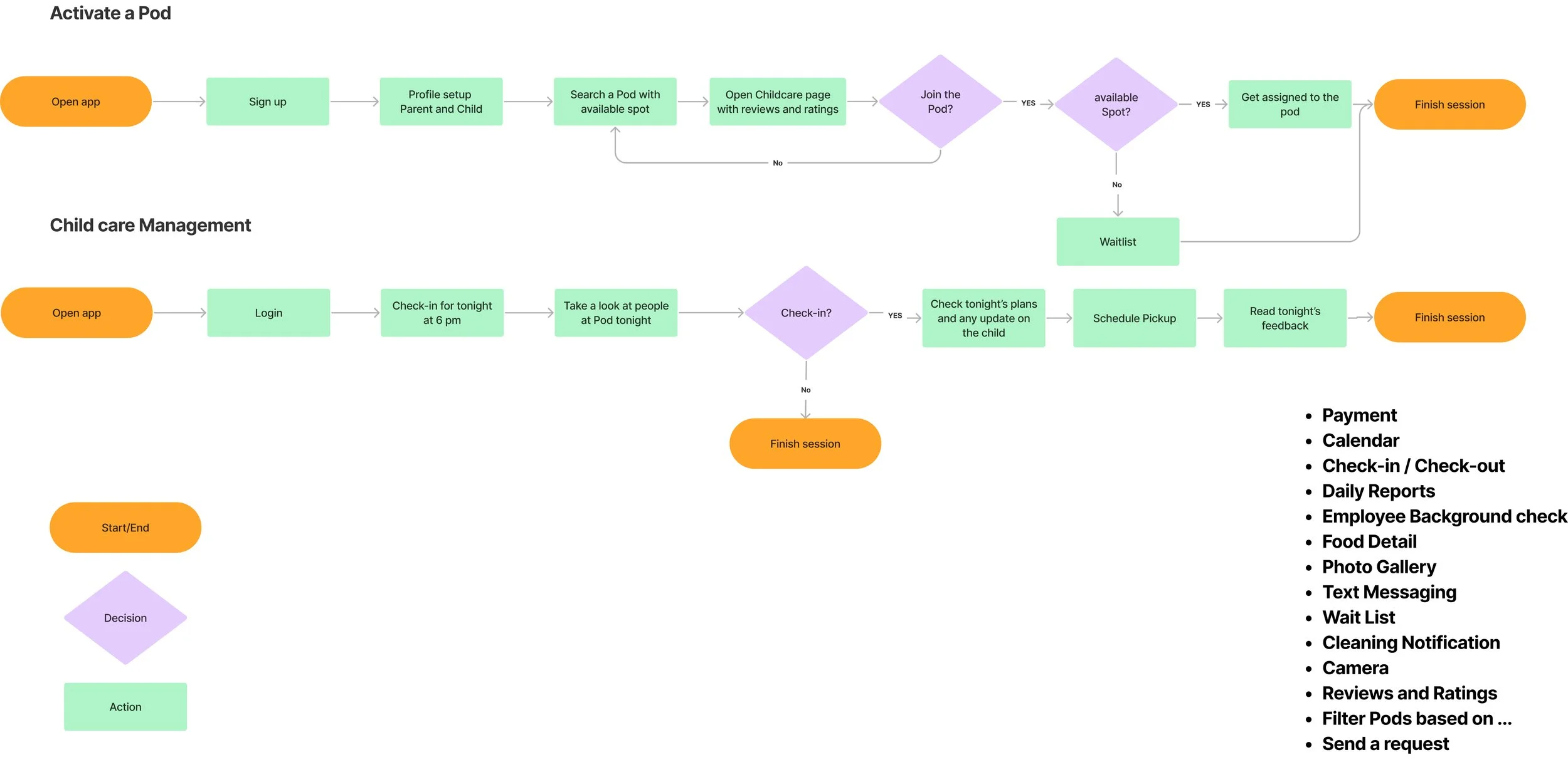
Goal: Allow parent to sign their children up for after hour childcare, activate pod, and manage process/information.
Task Analyses
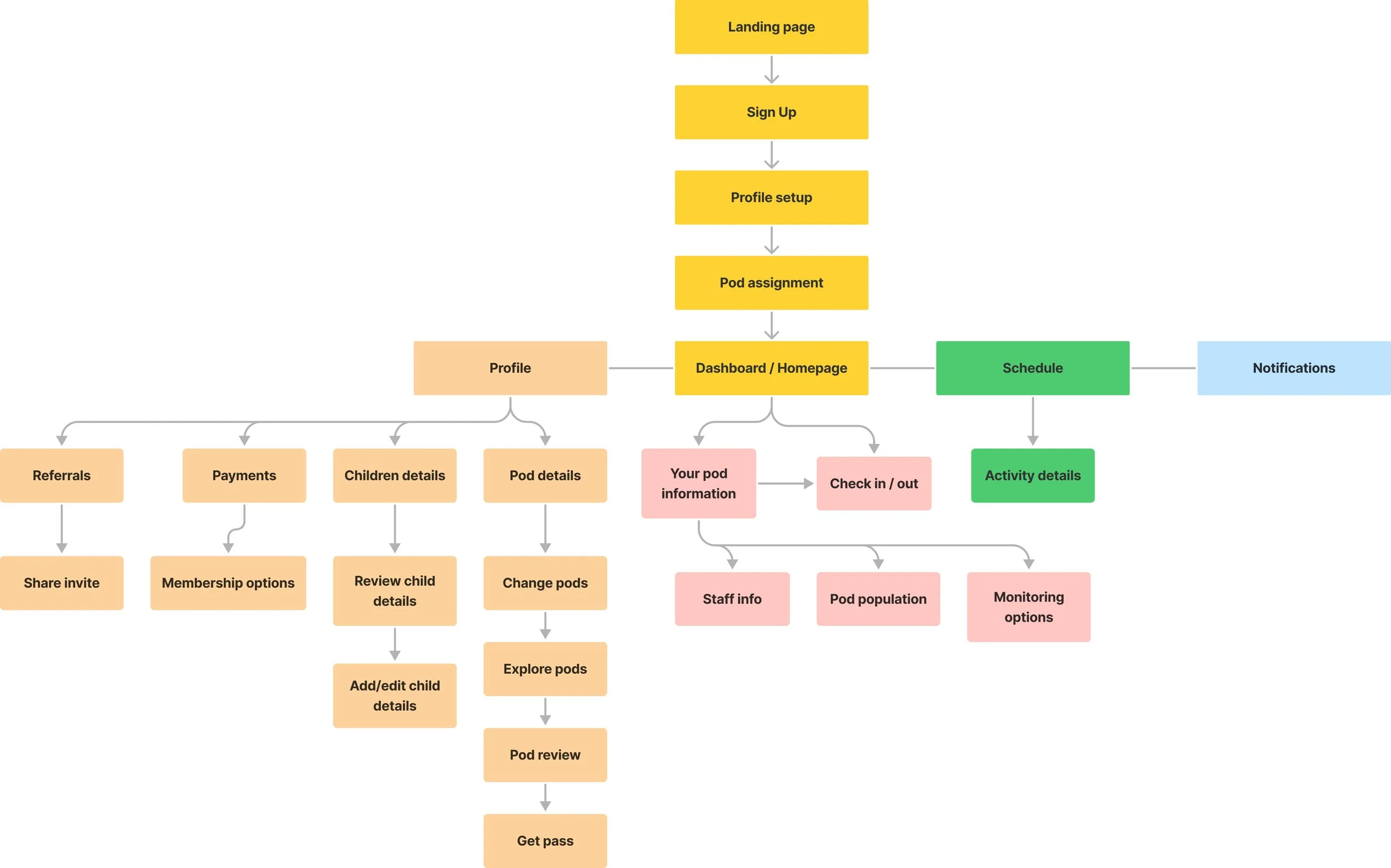
Information taken from the user flow, key performance indicators, and user experience interviews allowed us to conduct a task analyses and give us a strong foundation for the layout of the mobile design and screen format.
Designing/Sketching
Sketches were created to help determine the best way to approach certain features and figure out how we would transition and navigate through each task. After the sketches were completed, the first wireframe was built.
Wireframes
Usability Testing Goals/Task #1
Assign the user the task of signing up for an Avi Care membership.
Have the user navigate thorough the payment screen to finalize their new membership.
Select the pod that is closest to their desired location.
Methodology
The usability test was administered through Zoom. Screen sharing was used so that we could observe the users’ reactions to the assigned tasks and see how/if they accurately navigated though the prototype. Using a shared link of the Avi Care application, I asked the users to think out loud so that I could better identify their thought process and actions during the assigned tasks.
Usability Testing Goals/Task #2
The user was asked to navigate to the home log in page and sign their child up for Avi Care.
After signing their child up, users were tasked to navigate to the profile page and find the reference tab to add a reference.
Once confirmation was received that the reference had been added, users were instructed to check their child out of Avi Care.
Quantitative:
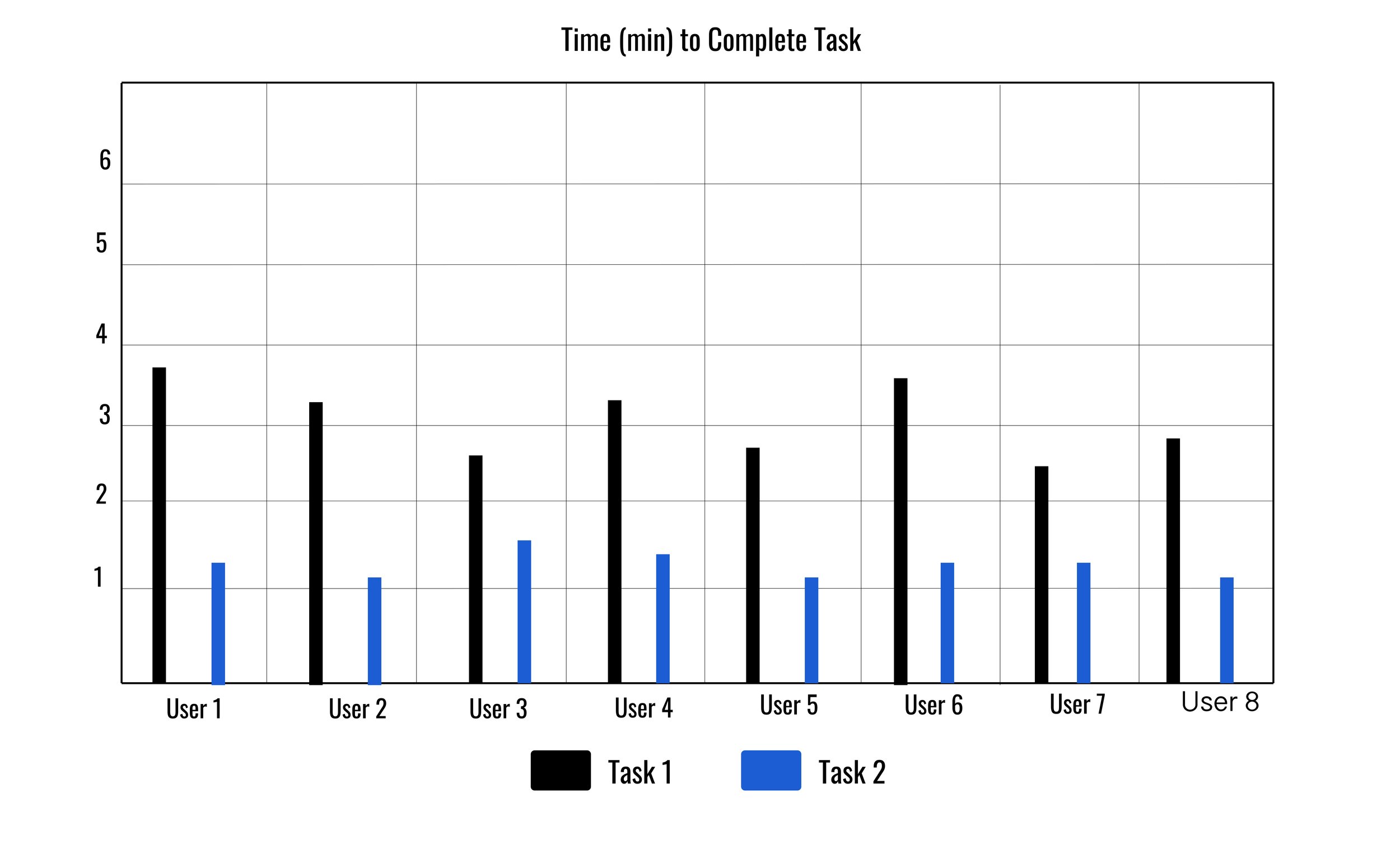
Total time it took to complete each assigned tasks:
Signing up for Avi Care exclusive membership
Adding a reference to the parent’s account
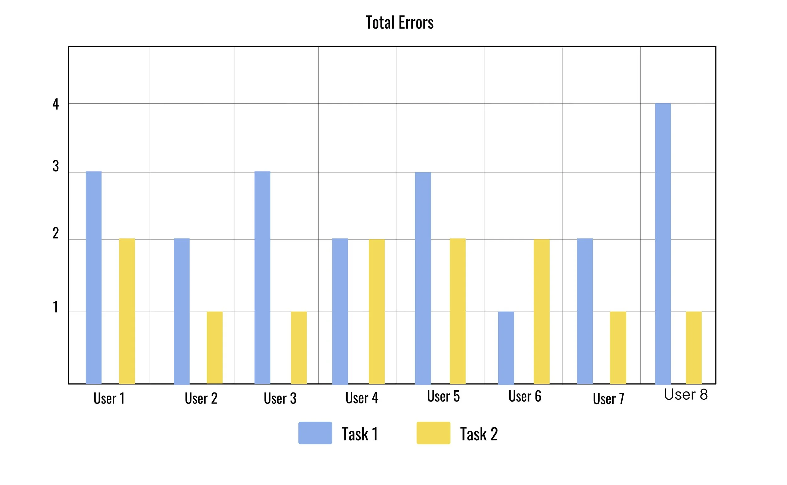
2. Number of errors made during the assigned task. Were they completed or did they fail?
Qualitative:
Analyzed the affinity map process allowing us to relay users thoughts and provide accurate data
(SUS) score questionnaire was used to measure the overall usability
The average number of errors when navigating through the sign up process was 2.5 errors. All users had difficulty moving through the sign up process. The average number of errors to complete profile access and add a referral to their account was 1.5 errors.
Average SUS Score = 87
Final Design/Prototype
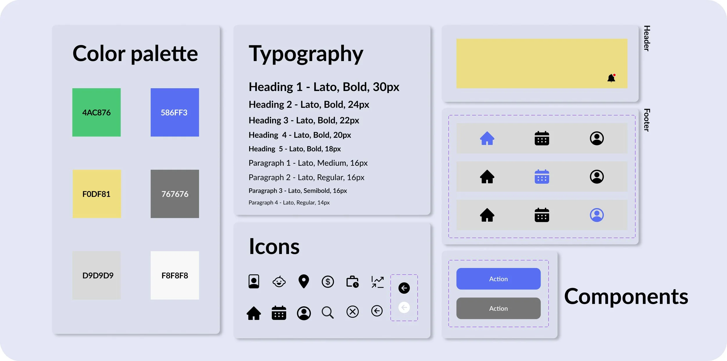
The design System and logo utilized the color blue because it evokes feelings of calmness and responsibility. Yellow was also used because it evokes happiness and warmth. Both of these colors embody what childcare should be for both the parent and the child.
Design System
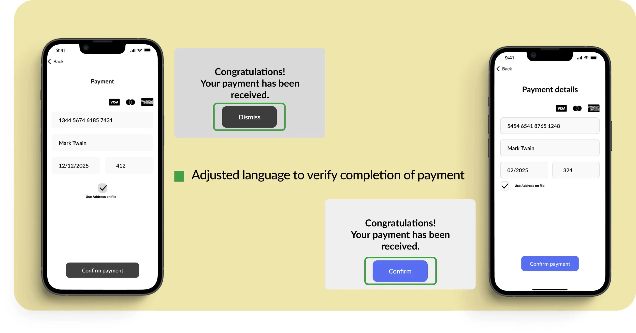
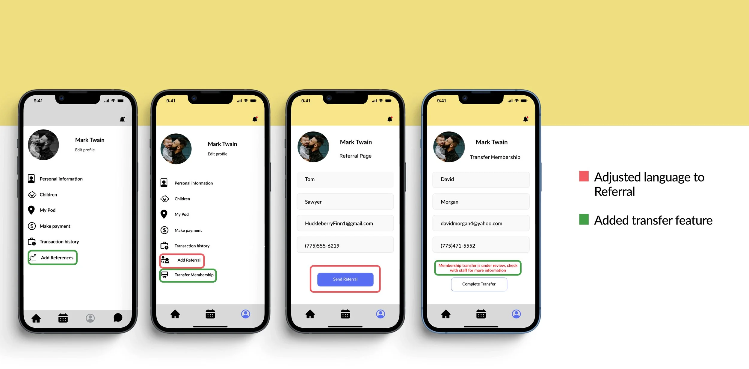
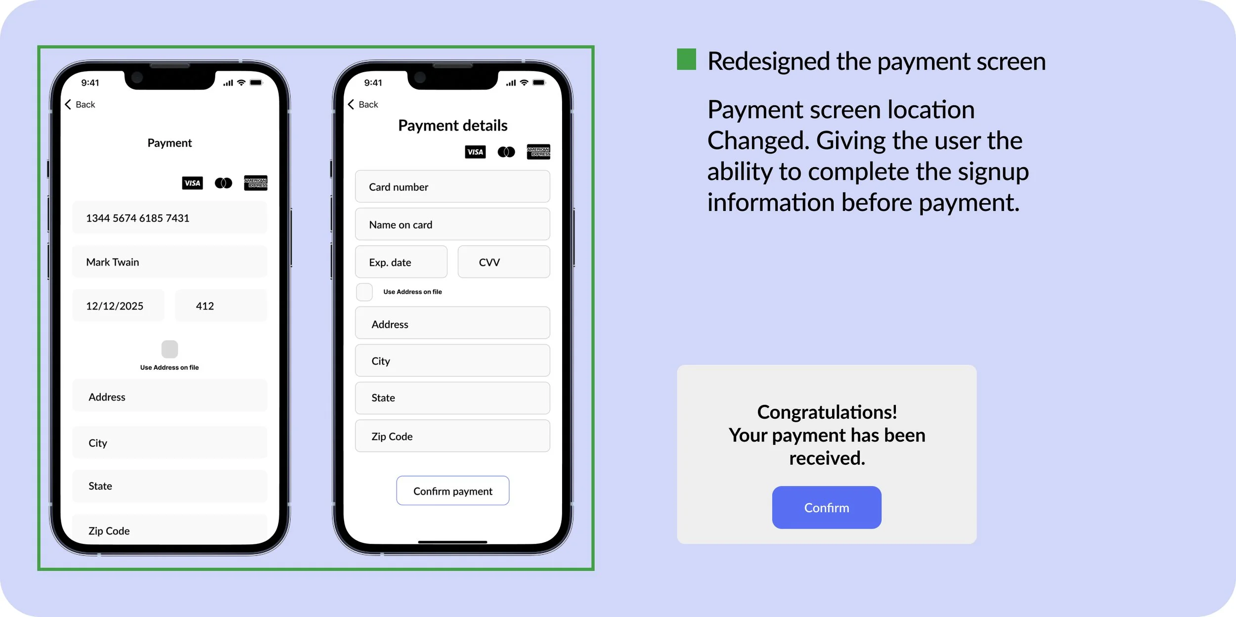
After incorporating data from the usability tests, the iteration process was started. Several changes were made to help bring clarification to the payment process:
Change the auto populate button for the user’s address.
Adjust the language to confirm payment acceptance.
Add a language reference control to the referral button.
Add a new icon for referral button.
Add the ability for users to transfer their membership.
Next Steps:
Include two more rounds of usability testing to increase the SUS score.
Adding food tracking allergy options.
Add staff qualification updates and reviews.
Add video monitoring options
